Problem & Goal
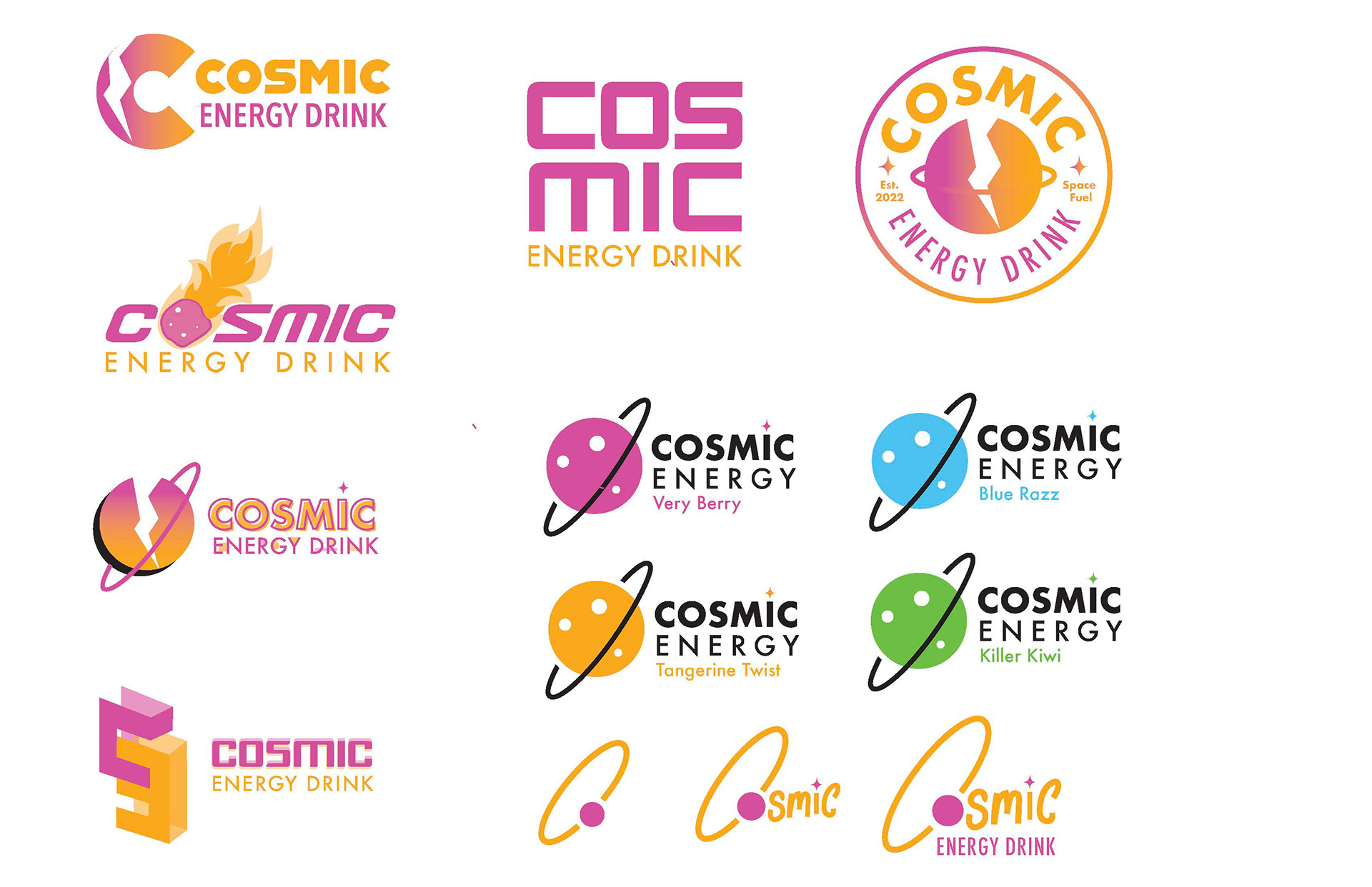
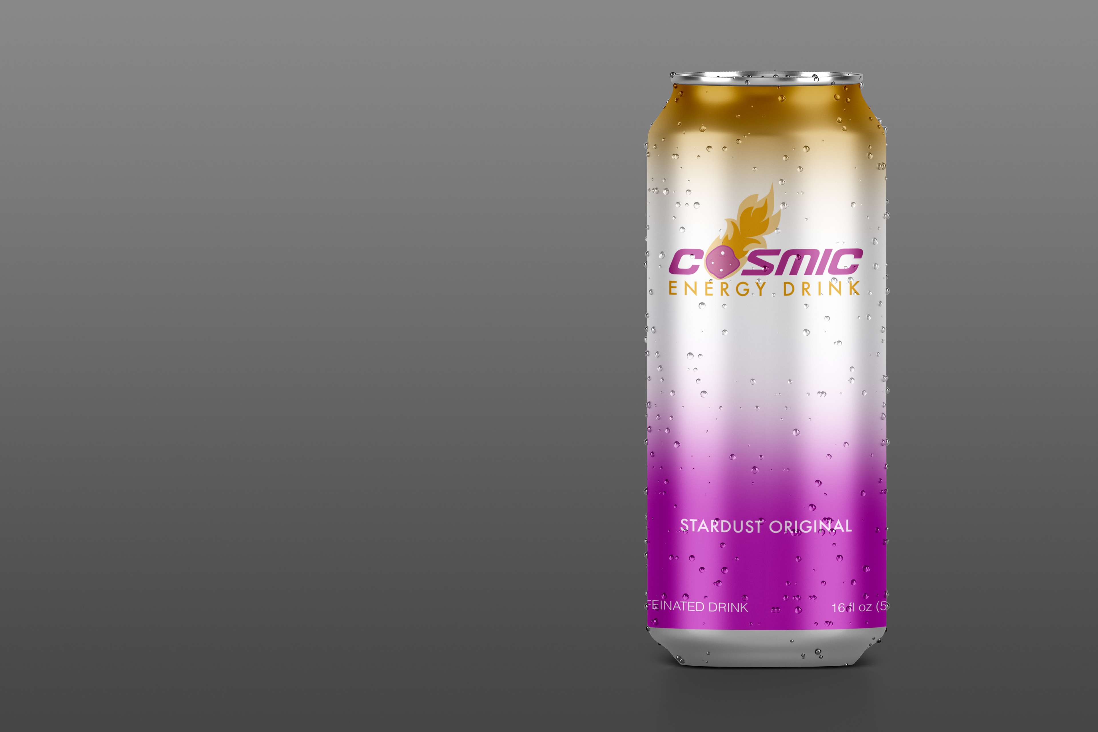
For this project, we chose a word from a list, and from there on we could explore our creativity and make any sort of product or service. I chose the word energy and made up “Cosmic Energy” which would be a space-themed energy drink. We had to create 8 different logos using styles such as responsive, illusion, and adaptive. My goal for this project was to not only use different styles to create a brand using the same name but also to make sure that each logo gave a different feel and emotion. For example, I wanted some of my logos to be very useful for a corporate setting, a minimalist one, and also playful ones that would be in comparison to the Monster energy drink logo very eye-catching and busy. Another was to place some of my favorite logos on mockup cans to give a feel for how that would play out in a realistic setting.
Strategy & Process
The first thing I did for this project was start sketching ideas for each logo style. After refining each of those I used the pen tool and traced those illustrations. From there I chose fonts on Dafont.com that corresponded with the aesthetic of each logo style. After doing this I began incorporating color and researched palette ideas that give off a fun and energetic vibe. I landed on a deep pink and orange-ish yellow for most of the fonts. The only one a bit different was my adaptive logo being that I wanted to include a more realistic flavor choice rather than keeping the same color set. After a long process of making certain edits and moves to get my final logos, I placed my favorite logo on mockup cans in Photoshop.

