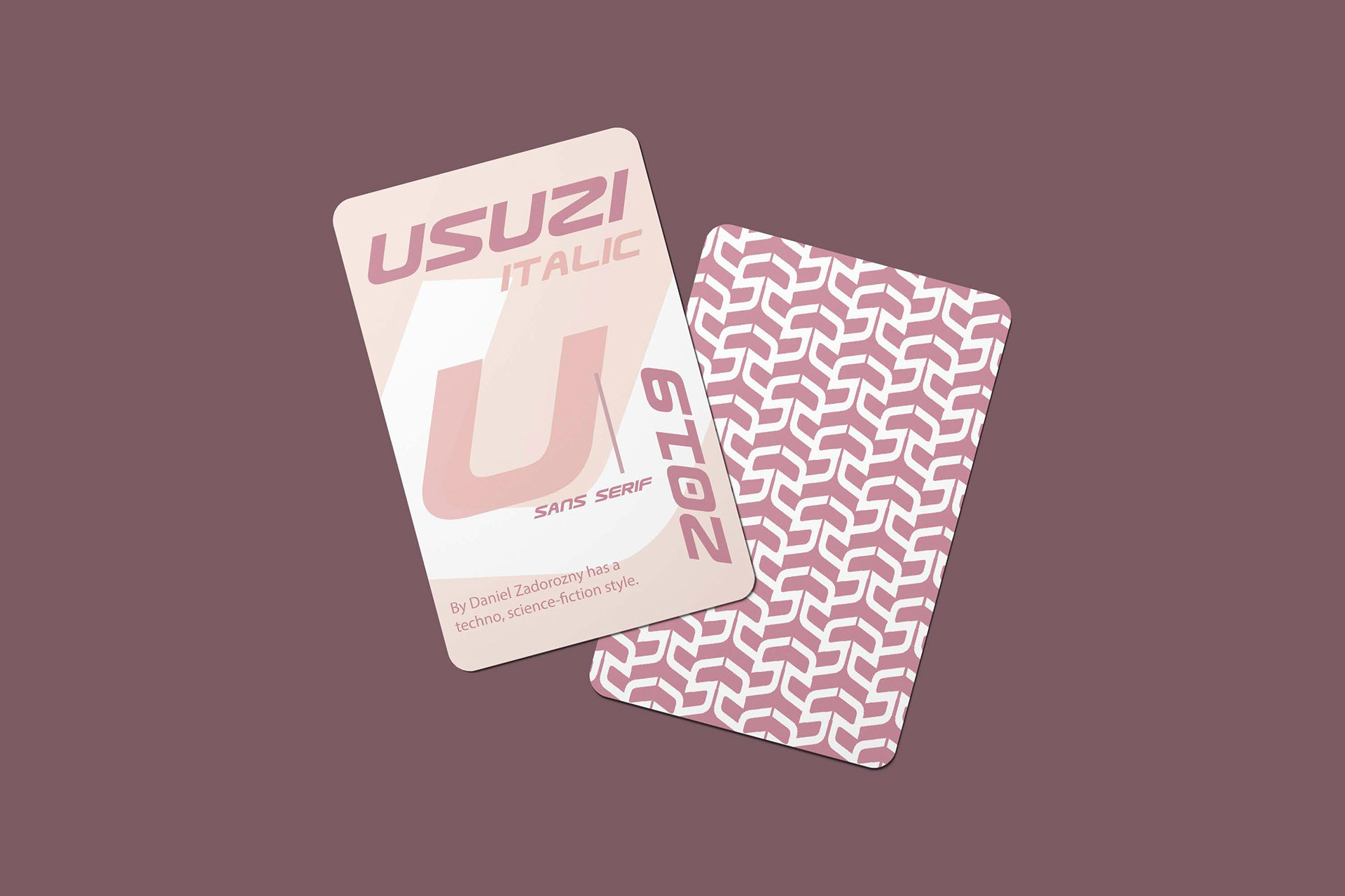
Problem & Goal
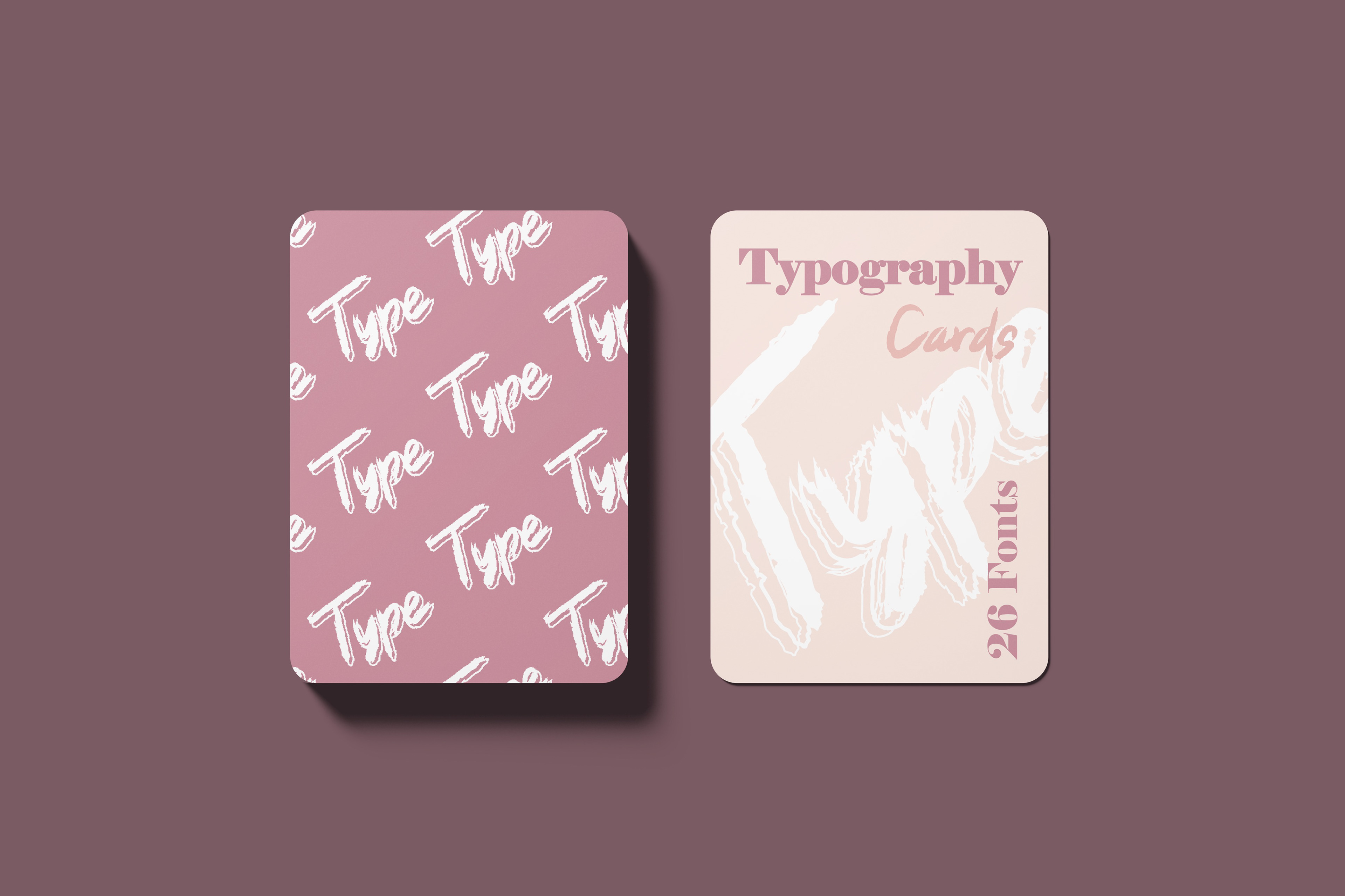
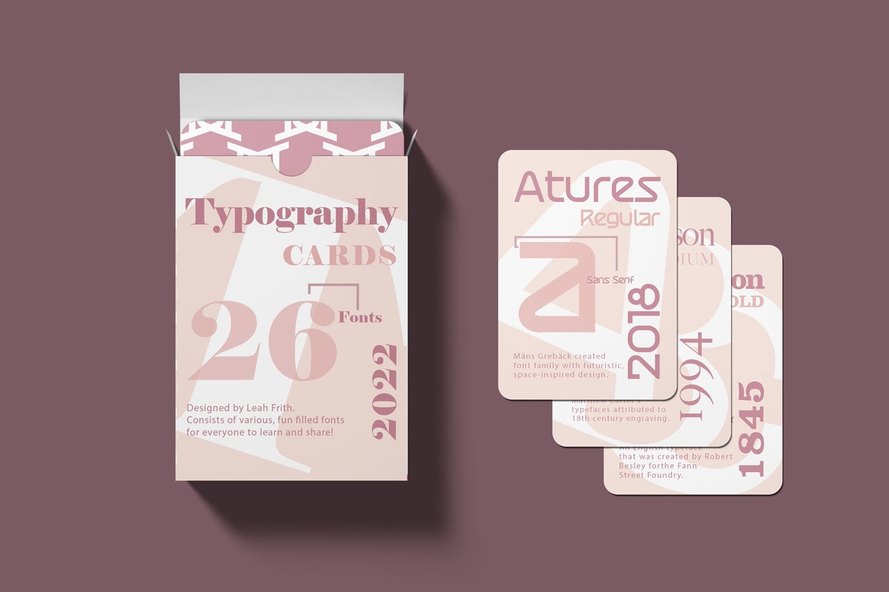
The objective of this project was to create playing cards for multiple different fonts and go in alphabetical order from A to Z. And also applied a pattern using only the letter and corresponding font used on the front of the cards. My goal for this project was to really step out of my comfort zone when it came to picking a color pattern for these cards. I tend to use bold colors so it was time to soften up and go with a pastel color palette.
Process & Strategy
My strategy for this project was to gain more knowledge about hierarchy before even starting. Make sure that the important information is seen first rather than the smaller details. I also used overlapping as a way for viewers to not only catch a glimpse of the lower case letter but the upper case in the background put at an angle. I began with sketching thumbnails of placement ideas that came to mind and how big I wanted certain words. After taking my refined sketches I chose fonts that started A-Z and began setting the cards up. For the back of every card, I used the pattern tool after playing around with small letters and creating them. Since the front of the cards were so light in color I wanted a deep pink and then a light pattern to contrast. My process on the box was to make it a bit more playful and fun with the word typography scrambled together on the back. But also keeping a similar setup used on the front of cards as well.

