Challenge & Goal
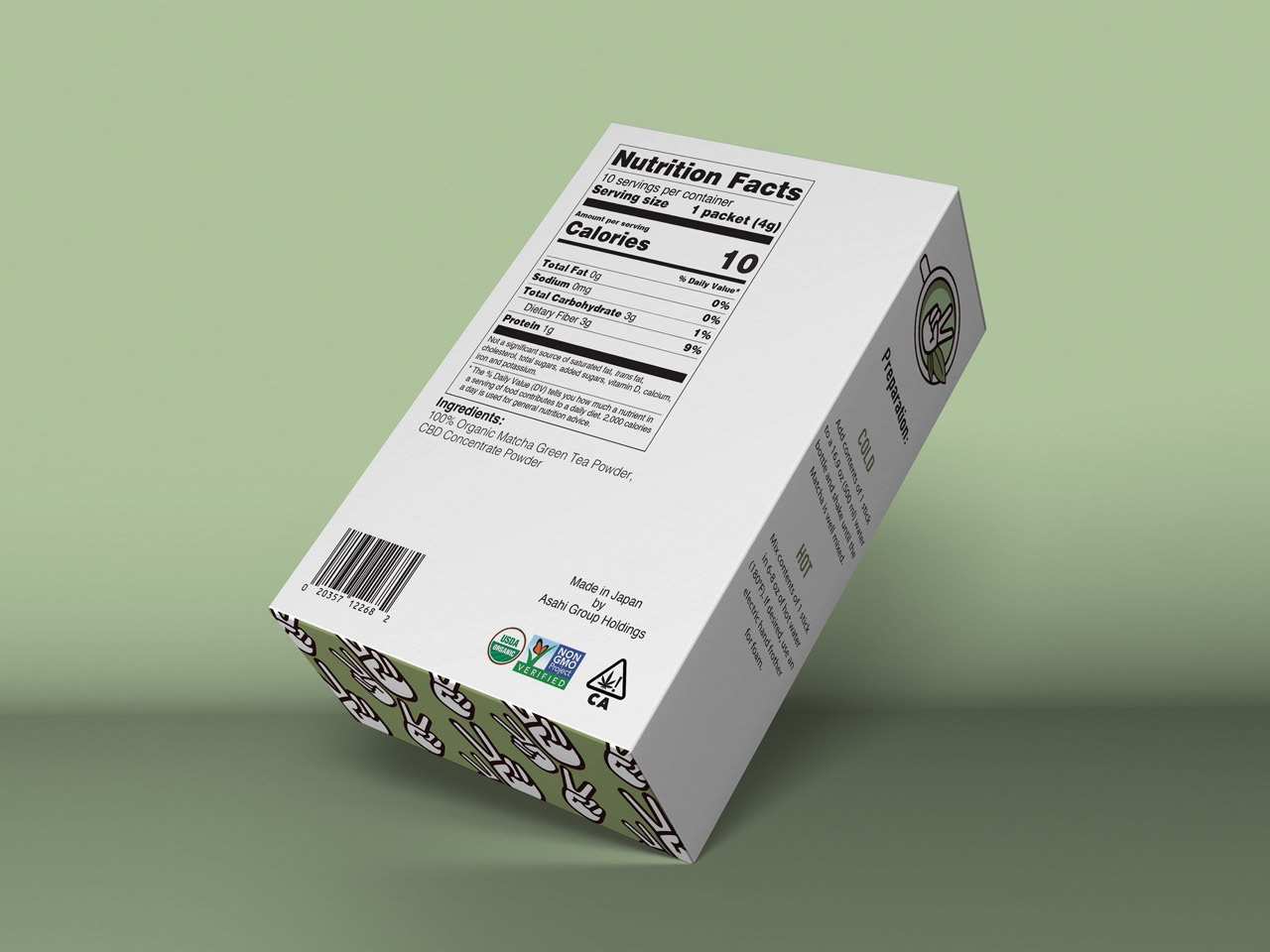
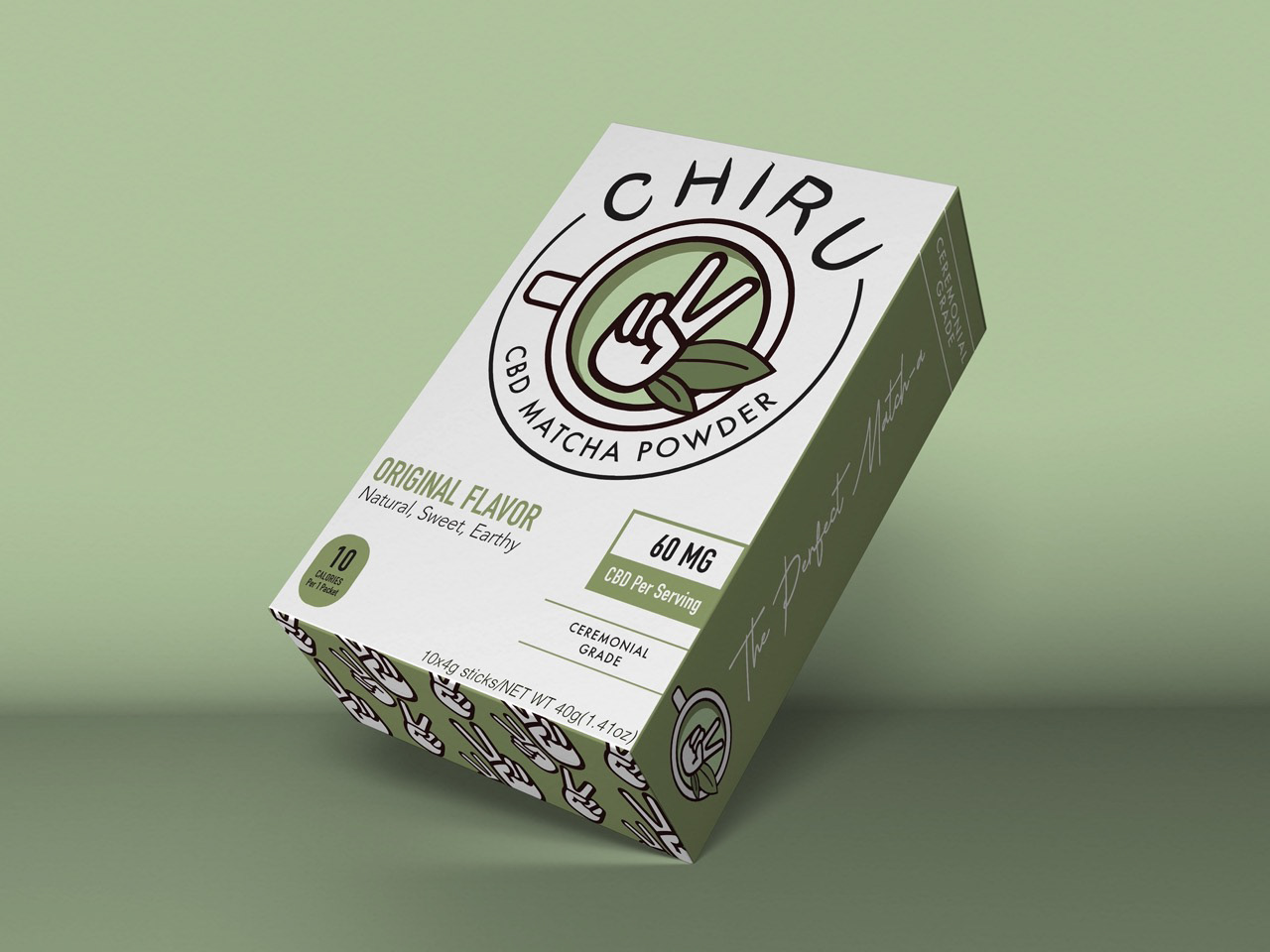
Chiru is a hypothetical matcha powder brand. The goal of this project was to develop not only a logo but a branding. After these were established then my challenge was to style a packaging to hold the product and work on measurements and crafts. Another challenge for me was making sure I had all of the FDA requirements and food nutrition labels. We then using cardstock paper and X-acto knives cut and taped everything together.
Strategy & Process
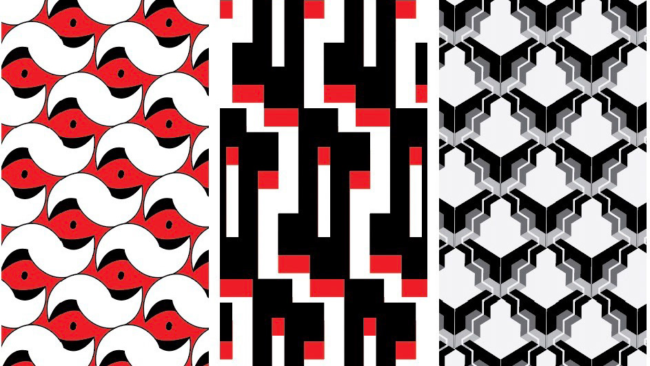
My strategy for this project was to first research the history of matcha and its influence in Japan. After doing this I came up with the name Chiru and from their starting finding objects or symbols that I associate with being calm and chill. So from there, I started designing the peace sign hand and associating the variations of the green color with the green matcha tea. Then from there, I created a pattern for the side of my packaging using my already made peace sign. Then from there, it was just trial and error of making sure the size of all of my nutrition and labels were the correct size when printing and constructing. And finally I not only constructed these in real life but I put them in mockups.

