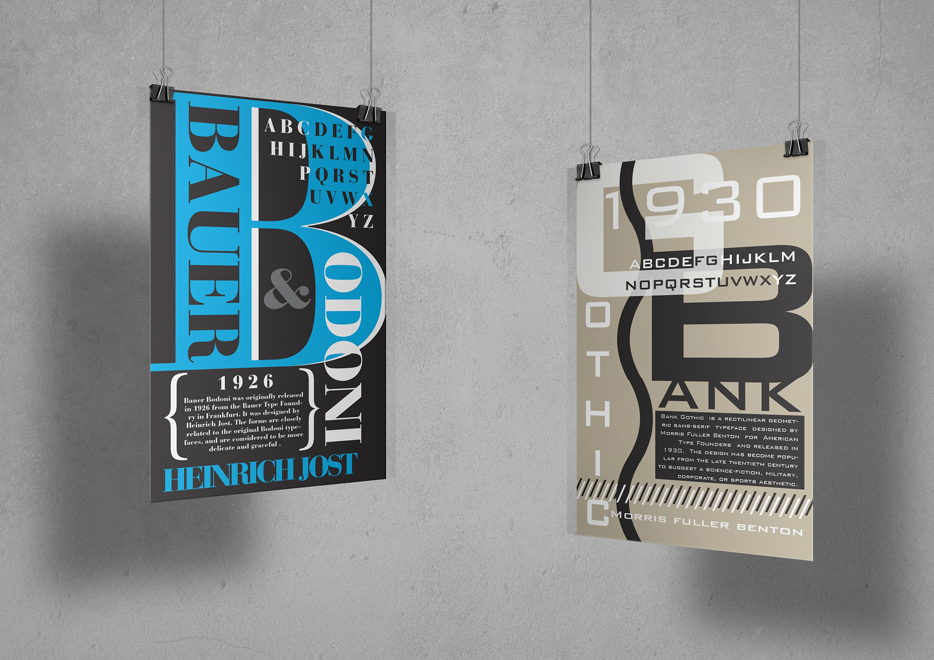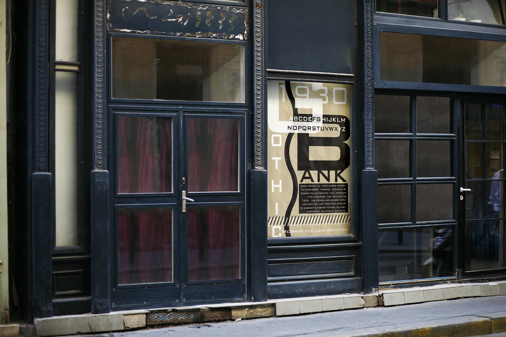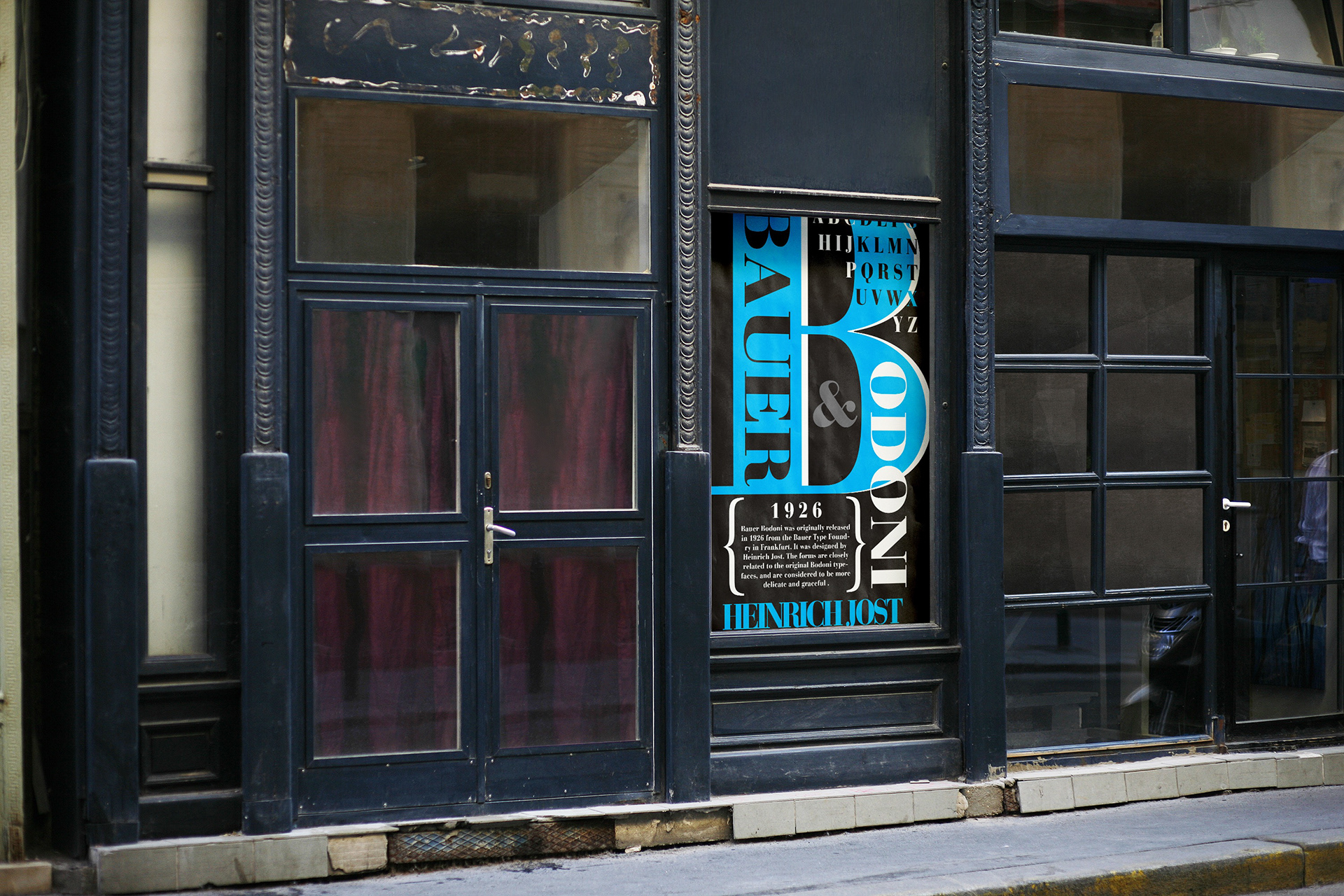
These are two posters showcasing two fonts of my choice. For this project, I chose the fonts Bauer Bodoni and Gothic Bank. The goal for this was to focus on hierarchy and making sure certain elements pop out at my viewer. For the top poster, I stuck with very bold colors, strong black and bright blue. For my second poster, I went in a different direction and went with an earthy tone and black. Each poster includes a history of each font and the alphabet showcasing the font characteristics.