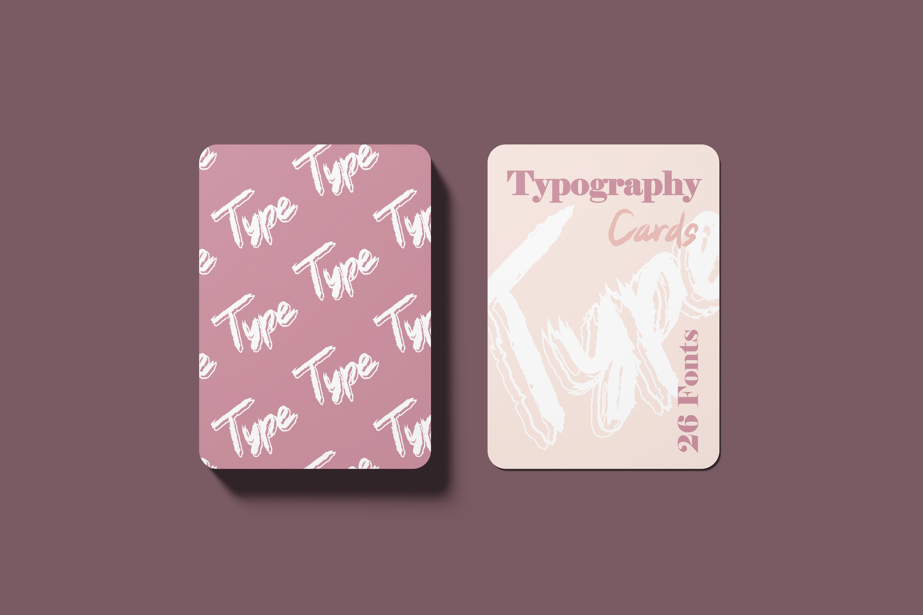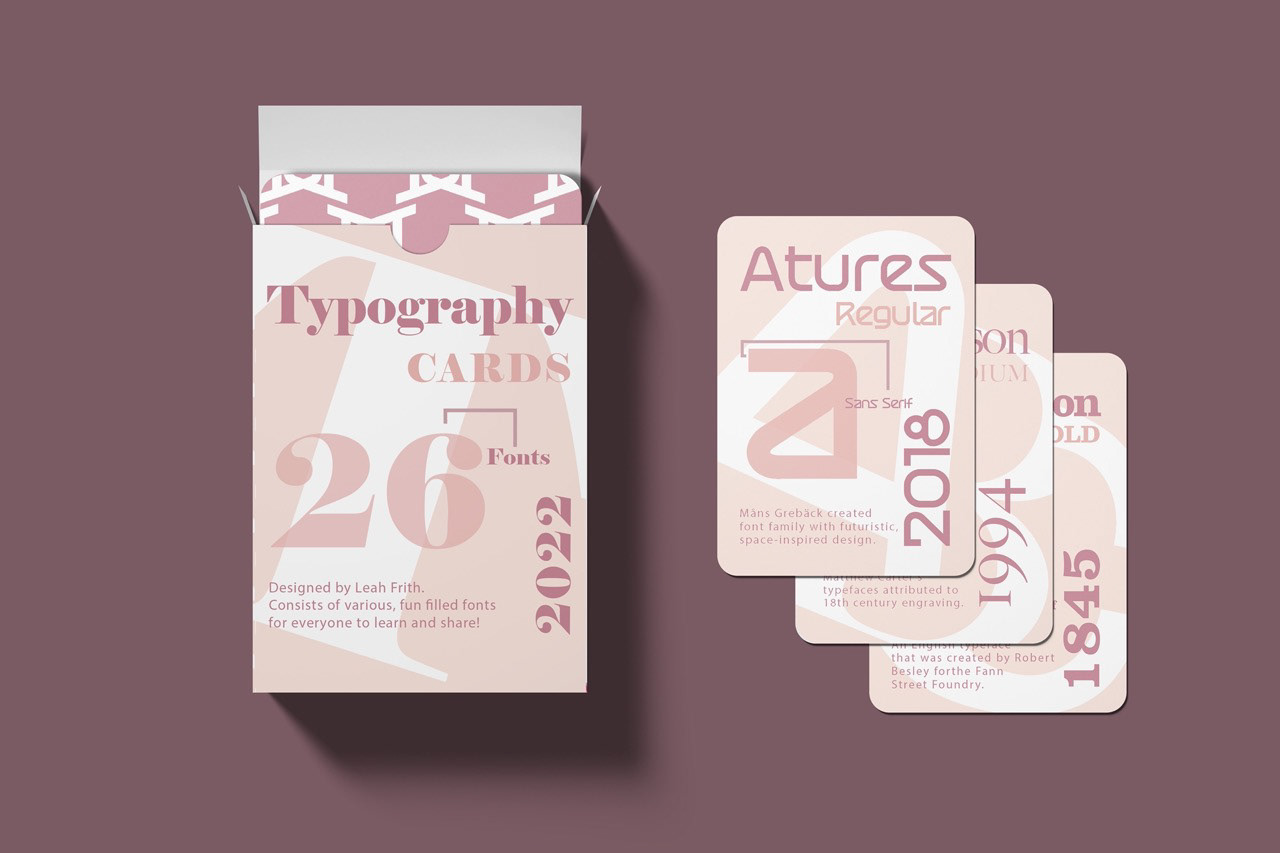
The goal was to design playing cards that will fit a variety of fonts and be arranged alphabetically. Additionally, a pattern was applied using simply the letter and corresponding typeface from the cards’ fronts. I started laying together the cards after selecting fonts that began with the letters A through Z from my revised sketches. Since the color of the cards’ fronts was so light, I created a deep pink and then a bright design as a contrast. My concept for the box was to make it more lively and engaging while preserving a similar structure utilized on the front of cards.